Over the years MPRM has played an integral role in helping our clients develop their brand narrative. We work with startups to establish their brand vision and mission and with established companies on rebrands and refreshes. While our focus is on the literal telling of the story — the voice — we often collaborate with designers on the visual elements essential to brand identity. This year we were the client. While we have continued to keep our narrative relevant, we felt our logo was in need of a refresh and our website a complete redo.
Despite our experience guiding others through the brand process, we were not immune to the challenges many companies face. Chief among these is the “I’ll know it when I see it syndrome.” This is particularly true for visuals but can also include copy. Finding a good partner who can intuit your vision and turn it into a reality even better than you could ever have imagined is the foundation for success. After interviewing several design shops, we chose Stephen Ludwig’s Group22 because we liked his willingness to involve us deeply in the process. The result was a great collaboration grounded in constant communication which gave him and his team the room to experiment with ideas that might not have been possible otherwise.
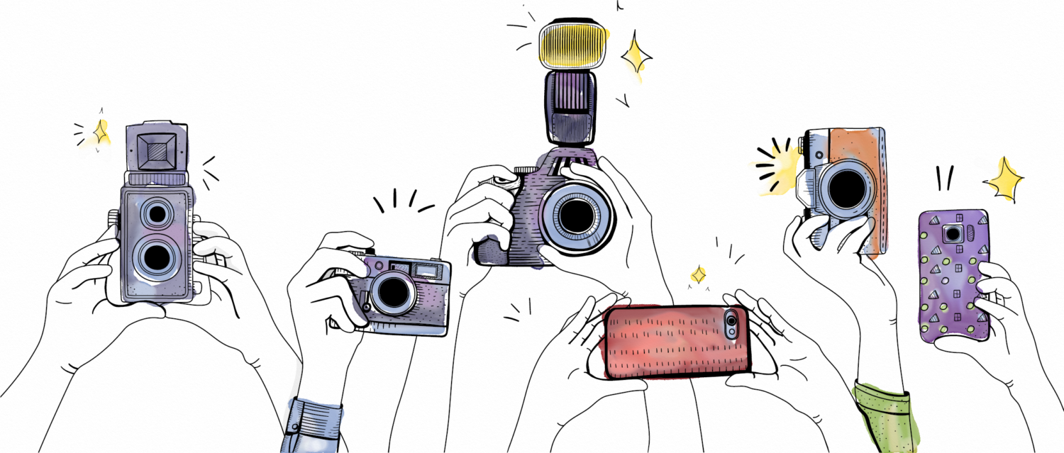
We began with an exercise that involved the entire company weighing in on our brand personality via an anonymous questionnaire designed to narrow the definition of “who we are” down to three words. Those words — bold (yet sophisticated), passionate, authentic — would be used to inform decisions about color and typeface. We knew we wanted to modernize the color palette but wanted to stick with our logo mark. We tasked a small group of three to guide the process and winnow down the choices before making a presentation to the senior team. This helped move the initial process along quickly and enabled us to settle on fonts, colors and ultimately a new logo pretty quickly. Where we got bogged down was selecting the key art for our website. We didn’t want a stock art look but weren’t going to invest in custom photography. This became the “we’ll know it when we see it” phase of the process. Although we found some amazing photography that really worked with our colors, it didn’t work for us – or fit our “three words” brand personality. Contemplating illustration as an option, we were worried about the limitations on what we found on the stock sites until Stephen showed us how he could edit and tweak with watercolor. We shared each step with a larger group of staff members to ensure the final design would be enthusiastically embraced by our entire team.
One of our biggest concerns was being able to easily edit our site, capabilities deck and new business proposals, a problem we had suffered through in the past. A great look doesn’t get you very far if it isn’t functional when it comes to basics like email signature, business cards, letterhead (now digital), and powerpoint templates.
Introducing a refresh is the final step, which means making sure the website, email signatures and socials all feature the new look. A new brand or rebrand will require locking in web domains and social media accounts as well. For clients who are launching a new brand or rebrand, we typically couple the new look with a relevant piece of news — partnership or content launch — to support their new narrative in order to make it newsworthy.
We’re excited about the results of our brand journey and feel we benefited from lessons learned over the years. That’s why we chose to introduce our new look with a story about how we got here.
* * *